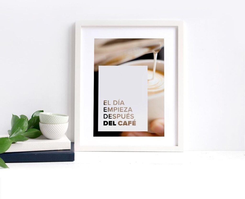
Have you ever heard the mythical phrase “everything returns”? Sure you do, and this phrase is applicable to fashion, decoration, and even graphic design.
In fact, in graphic design, we start from the techniques that have always existed and we reinvent them by giving them a new look. In our tireless idea of making the world more beautiful, today we propose a basic Photoshop technique to create beautiful sheets to decorate any corner.
Actually, who says pictures, says banners for your website, images for social networks, … whatever you want! This technique is so easy and successful that, once you master it, your mind will not stop thinking of possible ideas to carry it out.
I advise you that, before you start to layout anything, be clear about what your word or phrase will be and the image that you are going to insert as the background. As a detail, the sentence should not be excessively long, since it will cost you a tad more to make a composition in which everything is read well. Keep in mind that, when adding the texture, we always lose a bit of legibility, so the composition must be large enough.
All ready? Then let’s get started!
STEP 1
You have to open a file in Photoshop of the size you want your sheet. In my case, I am going to design it on a DIN-A4, the size of a “normal” sheet. Make sure that, if you are going to print it, it is at 300 dpi (you can read this post in which we tell you all the secrets to ensure success in printing).
STEP 2
Now you must insert the image that you want to use as the background and adjust it so that it occupies all the space. To do this, go to the top menu and click File → Place embedded elements.
Make sure that when you adjust it, you press the Shift key so it doesn’t warp you (this is a very common beginner mistake and can destroy your entire design).
STEP 3
The next step is to create a colored box, which shows a bit of the background image.
To create a color box, you must select the rectangle tool (or the ‘U’ key short code).
Make sure to give it the fill color you want to use, and uncheck the stroke option (in case you don’t want it).
STEP 4
Things are starting to get complicated! But don’t be scared, it’s nothing to write home about. The time has come to write your word or create the composition of your phrase ( in this post you have all the tricks to succeed with the design of your composition).
For the result to be beautiful, you must use quite bold fonts, since if you put them in a finite weight it is very likely that nothing will be seen as soon as you “cut” it.
It is the ideal time to get out of your comfort zone and try different and risky styles. Here I give you the example of two different designs with the same image and phrase, so you can see that everything is a matter of testing.
STEP 5
Once you have your composition ready, making sure that it convinces you where it is and how it looks, we are going to create this “clipping” effect. To do this, go to the layer where you have written the text, and select the Magic Wand tool (you can also access it with the short code ‘W’).
Now, click on an area of the phrase, so that the entire phrase is selected, letter by letter. It should appear outlined with a dashed line, as you see in the image.
STEP 6
With the letters selected, click on the background layer. The moment of truth has come, so if you are not 100% sure of your design, I advise you to duplicate this layer, so that you always have an original to work on again.
To duplicate the layer, stand on top of it and click the right button and select the “duplicate layer” option. I advise you to change the name to know which is the original and which is the cropped one.
Now you have to rasterize this layer so that you can work on it. Don’t worry about the fact that the letters are selected.
To rasterize the layer, hover over the layer with the colored rectangle, and click the right button. Select the ‘Rasterize Layer’ option. Et voilà!
STEP 7
Now, without moving from this layer of the colored rectangle, you have to press the delete key to remove the selection of the letters of the phrase.
Next, uncheck the visibility of the layer you have written on. Then, uncheck the selection by clicking on the option in the top menu Selection → Deselect.
In this way, those dashed lines that mark the selection will disappear.
STEP 8
Ready! You already have a beautiful sheet ready to save. You just have to export it and take it to print.
As you can see, the result depends a lot on the image style that you have below, as well as the tone that you have selected for the color box.
With very white images it does not usually give good results since the texture of the image is not very distinguishable. Although everything is a matter of trying and letting your imagination go free.
Can you imagine how good a print would look that combines this design trick with pretty letters which is also provided by nearby logo design company? If you dare to do this tutorial, we would love to see it.
